Use this Looker Studio template to track SEO performance
For as long as I’ve been in SEO, I’ve envied my paid media colleagues’ agility and performance tracking.
SEOs typically have had to exercise patience and a lot of manual building to get actionable performance data.
Inspired by a Looker Studio dashboard built by our paid media team, I rolled up my sleeves and constructed one for SEO.
The Looker Studio dashboard has been a game-changer for my team, and I’d like to teach others how to build their own.
This article will tackle the biggest insights and benefits of the report, along with the step-by-step process for building the dashboard.
The Looker Studio report’s biggest insights
Essentially, the report provides a clear live view of SEO traffic over time, with the ability to segment data (for instance, brand vs. non-brand).
You can compare date ranges like month over month and year over year, build separate reports by geo (e.g., U.S. vs. international), etc.
The biggest insights come from connecting SEO properties (channels, pages, etc.) to acquisition.
- What pages and content were useful?
- Where did traffic gains/drops happen?
- What was the most common entry point for sign-ups?
You can also do a breakout looking at how SEO is compared to other marketing channels (paid and direct, but you can also split out things like PR if it lives separately).
It’s a great way to assess where your traffic and conversions are coming from – and, with enough data, to evaluate where to dig deeper into optimizations and where you’re primed to invest more.
The biggest benefits of the report
It’s no news to SEOs that tracking the performance and impact of their efforts can produce a pretty murky narrative.
The discipline relies more on the scientific method – hypothesize, test, measure, tweak – than other channels with tighter input/output cycles.
In SEO, nobody knows what happens except for what the data and testing show you. That’s why it’s so important to have access to the right data.
This report lets you use and present data closest to the source of truth, which is incredibly useful in presenting to internal stakeholders and clients, checking as a touchpoint with your morning coffee, and helping dictate a longer-term strategy.
Another benefit of using Looker instead of third-party tools is connecting directly with Google Analytics and Search Console data.
I’m not trying to shill for Google, but as a direct descendant from Google Data Studio, Looker plays very nicely with our Google data. It comes with a couple of big bonuses, too:
- It’s free.
- It’s very easy to share with clients and teammates without any big log-in workarounds.
This means it’s also easy to solicit feedback from SEO stakeholders – and act on it quickly.
And having a shared point of reference enables richer discussions and gives clients awareness and insight into what you’re doing (which is often cited as a challenge in SEO).
Maybe the biggest benefit: once the report is set up, automatically updating, and needs little more than occasional tweaks and optimizations, you and your clients will have more time to talk about strategy and ideas.
Assuming you’re convinced you should have your own version, let’s learn how to set it up.
How to build the report
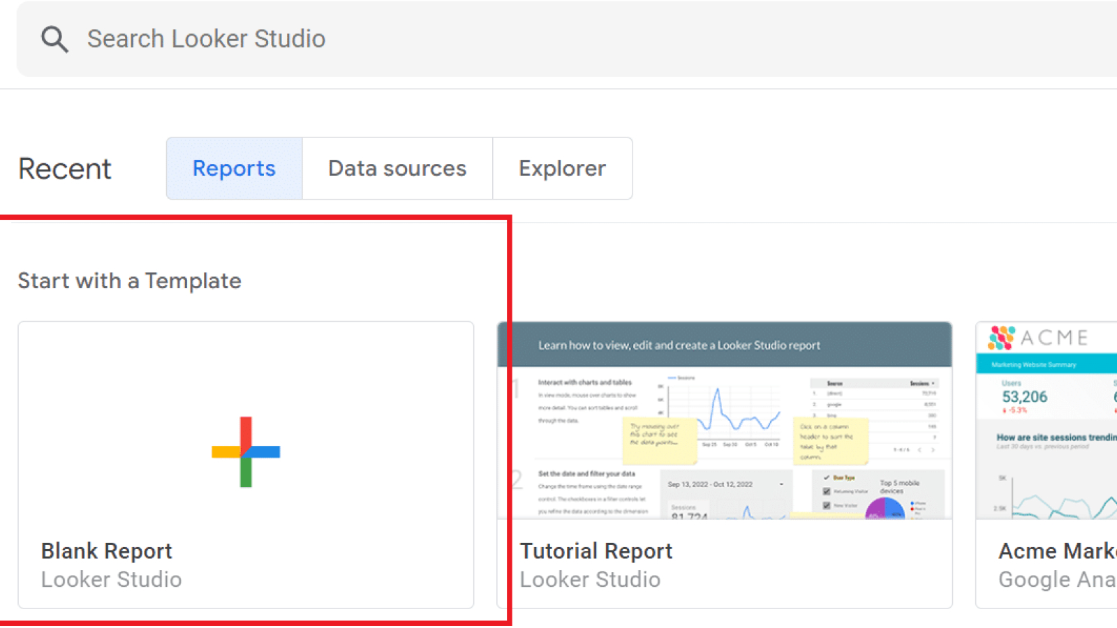
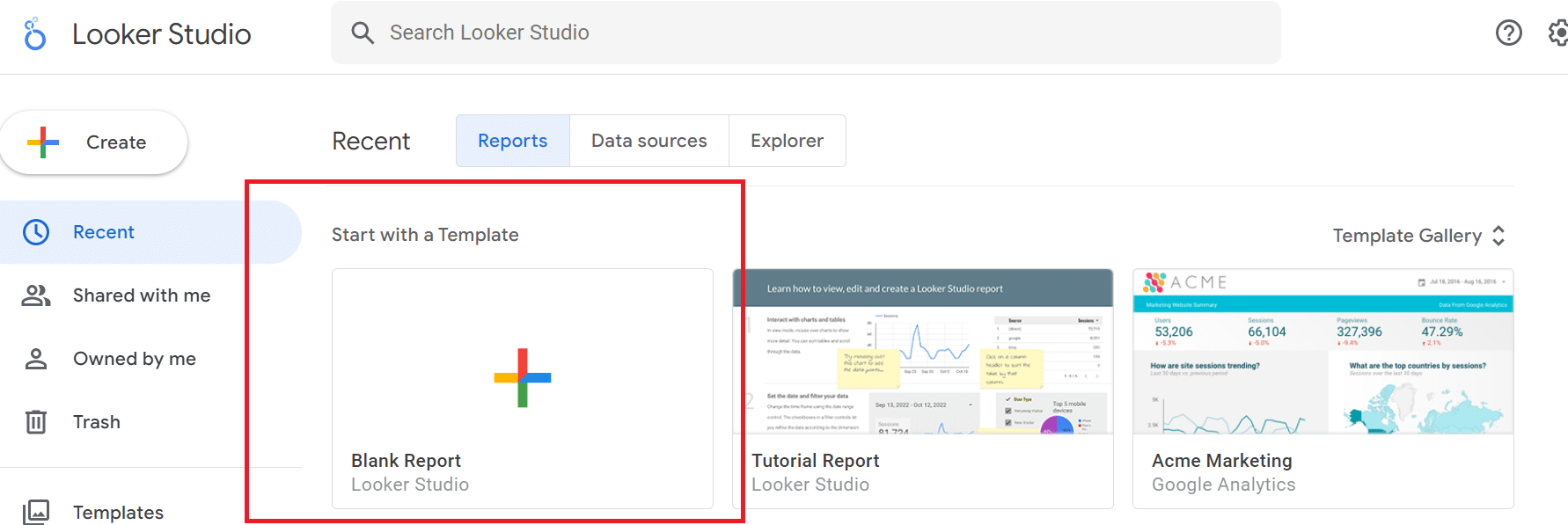
First, open Looker Studio and create a blank report.
Connect Search Console data:

Find your site under Sites, and click URL impression > Web to connect that data.
To get a picture of traffic over time, click Add a chart > Time series.
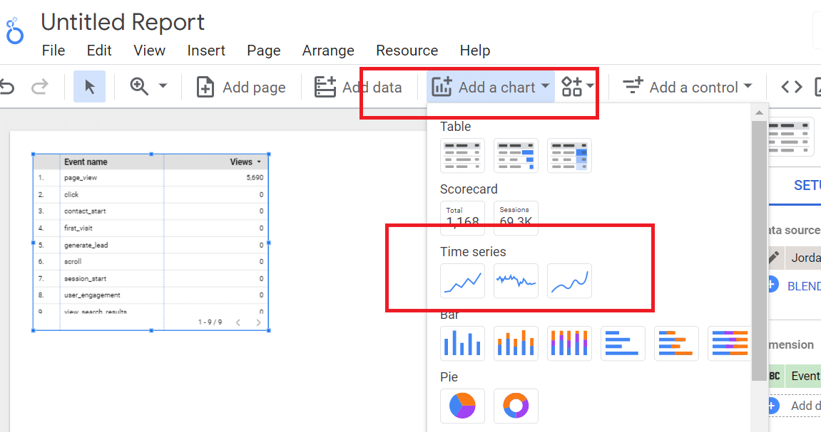
Under Chart > Setup, go to Dimensions and select Date (Year/Month). Go to Metrics and select URL clicks.

Under Default data range, select Custom and hit this down arrow:
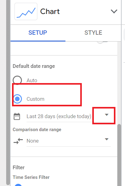
When a side-by-side monthly calendar pops up, hit this arrow and scroll to the bottom of the list to select Advanced.

Adjust your ranges by preference. For instance, to compare the last two months:
- Select today, then minus, and 2 months for a start date.
- Select today, then minus, then 1 Month for an end date.
(Keep in mind that Looker Studio allows you to set custom date ranges – both start and end – so play around and find out your favorite look-back windows.)
Next, add a table underneath your graph to layer more nuance into your reporting.

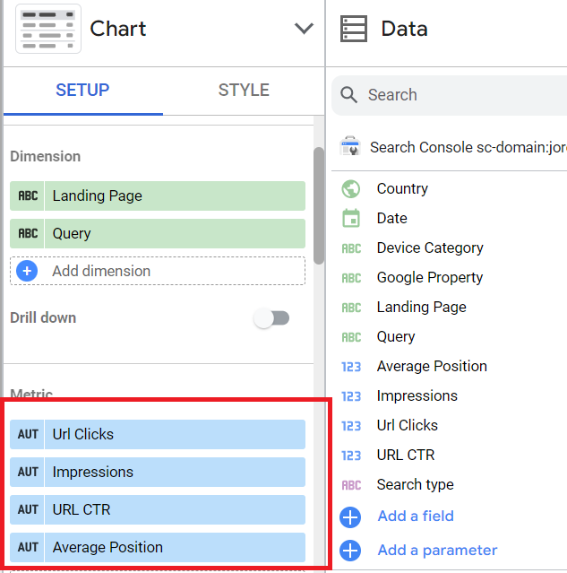
Go to Chart > Setup, and drag both Query and Landing Page from the Data column into Dimensions.

Under Chart > Setup > Metrics, go back to Data and drag URL Clicks, Average Position, Impressions, and CTR:
From there, you can adjust things like rows per page (under Chart > Setup) or footer pagination (under Chart > Style), etc.
You can manually drag the chart to expand and contract it horizontally and vertically – everything is flexible.
Now we can make things really interesting: let's look at brand vs. non-brand metrics.
Go to Setup > Filter and Add a filter.

Name your filter "NB filter" and select Exclude, Contains, and whatever works with your brand name (in our case, “jordan” of Jordan Digital Marketing). Make sure to save.

From here, you can apply the non-brand filter to any metric you like – traffic, clicks, events – to see performance over time.
To see all traffic, simply click out of the non-brand filter. (Note that adding a brand filter is a great idea as well to see the effects of your branding efforts.)
You can create dashboards for brand, non-brand, blended, side-by-side comparisons, etc.
Now let's add an important control – date range.
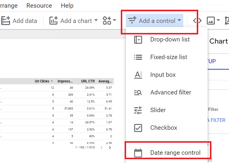
Click on your table, and go to Setup > Comparison date range:

Add whatever date ranges you like, and the data will include a delta showing performance over time.
If there's data you'd like to highlight for a certain date range, you can pin those to the top of your report by clicking on Add a Chart > Scorecard:

Click whatever box you like, and drag it to the top of your chart.
Note: Whenever you open your report, your scorecard number will auto-fill for the date range you've selected as a control (although you can adjust that whenever you like).
If you select custom date ranges, those are only good for the working session, while controls are the default view for everyone upon login.
Pin scorecards for different metrics and select year-over-year comparison ranges, month-over-month, etc. Add non-brand filters to analyze non-brand trends if you prefer. The interface is beautifully flexible.
I'd like to include another step: adding signups (or whatever you're naming your key events) to your reporting.
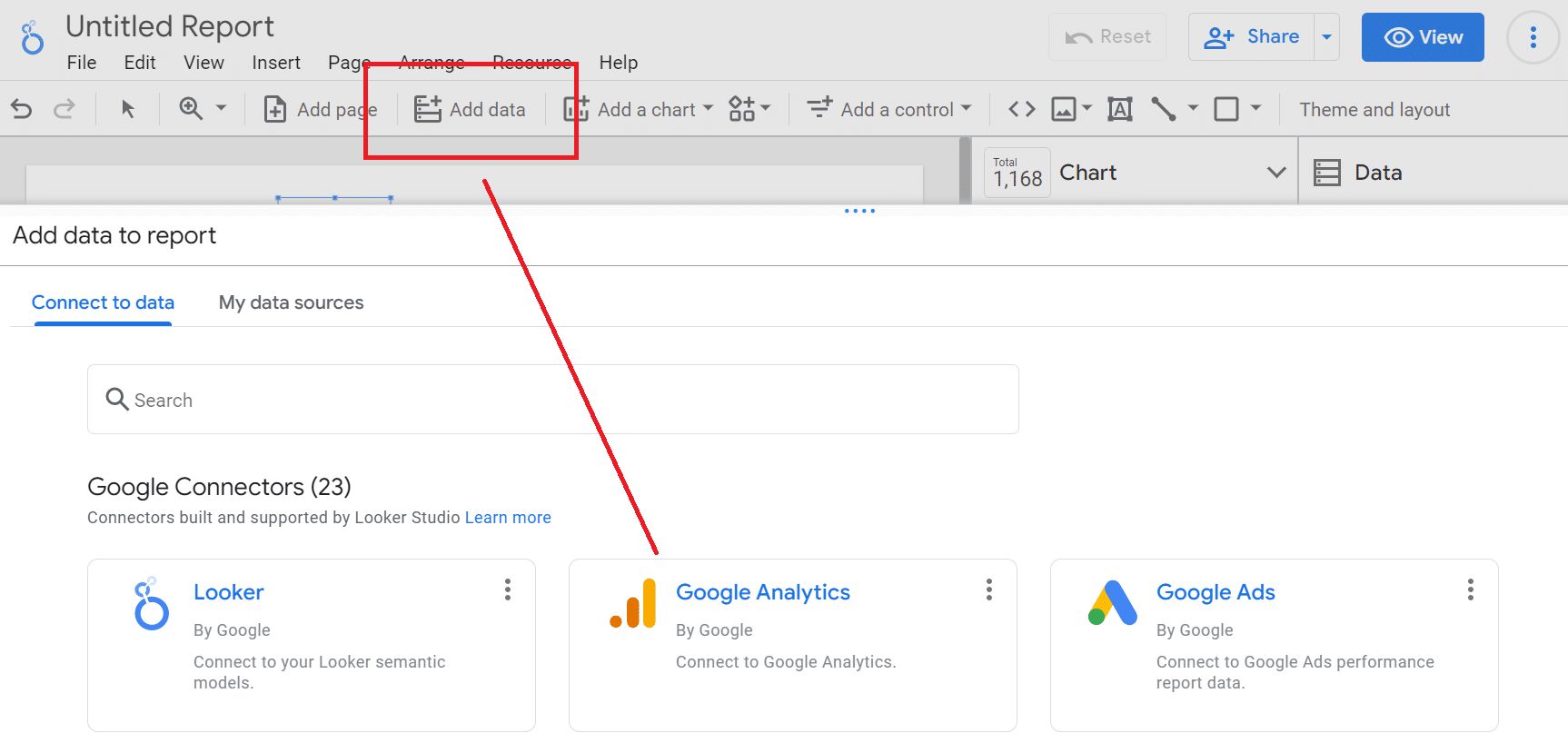
To do this, add Google Analytics as a data source by going to Add data > Google Analytics (assuming you capture signup data in GA):
Note: Since everyone needs to name their own events in GA (in our case, we're using “generate_lead”), you'll need to cross-reference GA data to ensure you include the right metric on your report. This is a custom name, not an out-of-the-box metric like clicks or impressions.
Find your custom metric in GA4 and write down what you named it.
Go back to your report, and click Data > Event count to pop a metric into your report:

Now you need to tell Looker what actual event you're tracking.
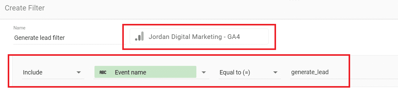
Add a filter by clicking Chart > Setup > Add a filter > Create a filter (blue box at the bottom of the column). This specifies the custom event you just looked up on GA and will auto-populate GA as the data source for your new filter.
Choose Include > Event name > Equal to (=), and type in your custom event name.
Go back to your report, and you should see a field with the exact number of events reflected for the same date range in GA4. (If not, double-check your event name.)
Add another date range control with comparison ranges if you'd like to compare event performance over time.
Now let's check out the source of all of these events. Click on Add a chart > Pie:

Under Setup, select Event count for metric and Session default channel grouping:
This should give you a pie chart showing a source breakdown for all events:

Apply the custom event filter you created a couple of steps above, and your pie chart should show the custom events driven by each channel.
From there, you can create a regular chart and add dimensions like page path to see journeys to conversion. For instance, this will show how many people visiting your blog eventually convert for a given time range.
By now, you should have the idea: you can slice and dice, compare date ranges, add layers of nuance, segment by brand and non-brand, etc. And each person on the account can do the same thing – and interact with the reporting as they wish.
What I haven't shown is something I'm happy to leave up to you and your brand: how to gussy up the visuals of the report using colors, labels, etc. I like our report's looks, but I won't presume you're here for my design skills.
My final advice: get in, get familiar, play around, and workshop your output with other stakeholders to see what other insights you can come up with. Happy reporting!
The post Use this Looker Studio template to track SEO performance appeared first on Search Engine Land.
from Search Engine Land https://searchengineland.com/looker-studio-template-track-seo-performance-395692
via free Seo Tools